Retail web
redesign
Contracted to redesign Apple's product detail pages. Solved for dated design, low gallery engagement, lack of marketing, and overly technical product information.
Apple
2017
Agency
Critical Mass
Role
Designer
WEB
01/05
Comped full explorations for each product, using section by section explorations
GALLERY
02/05
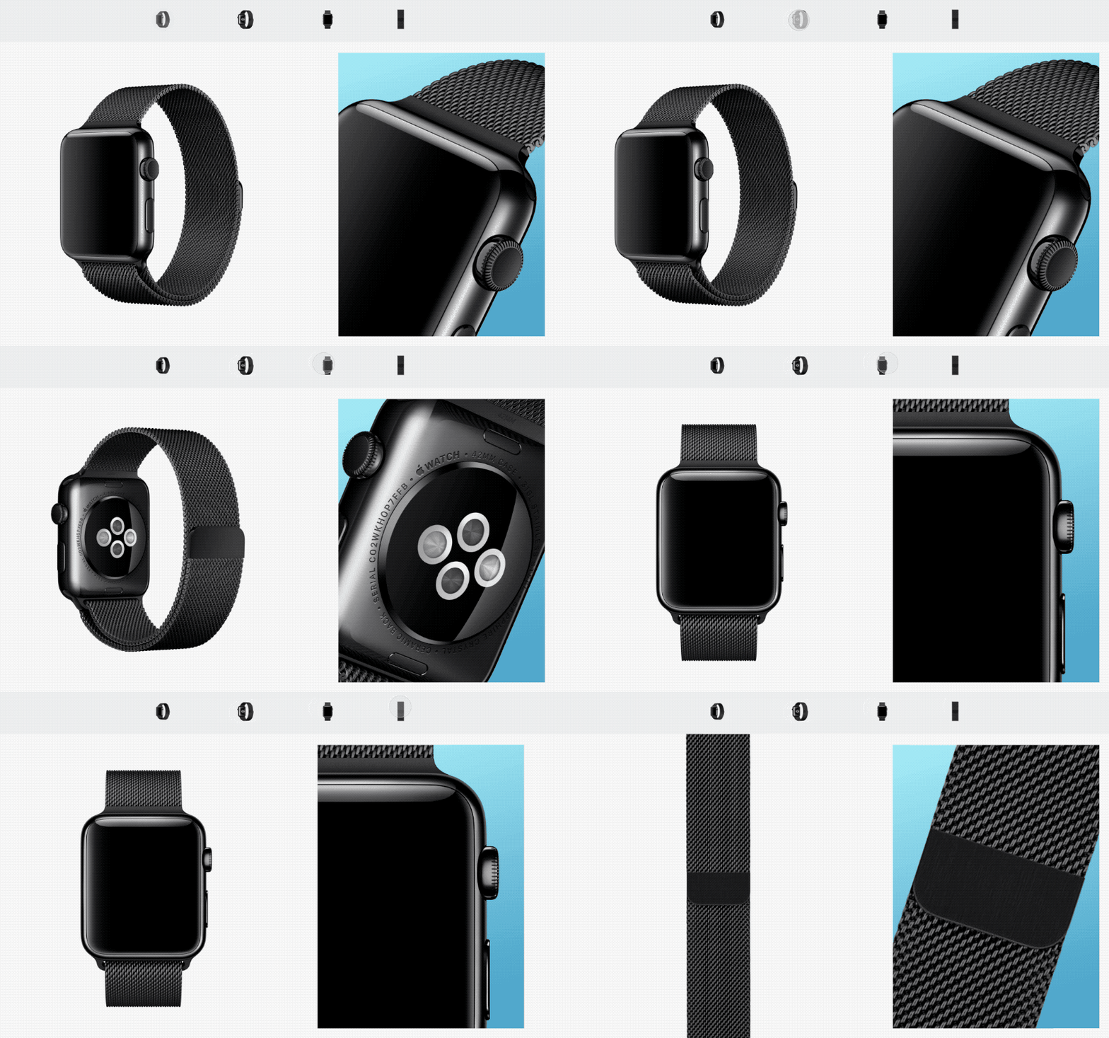
The gallery was hidden behind a link with a low click through rate. Proposed we surface them and use the renderings to make unique assets.
Although control angles were the only guaranteed assets, they proved useful for details in an interactive version of the gallery.
SPECS
03/05
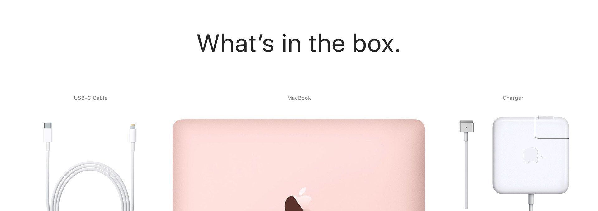
The "What's in the box" section was an opportunity for improvement. Laid out with our rendering assets, and borrowing from the virality of Apple product unboxing.
MKTG
04/05
If these pages are accessed from a side door, all marketing is missed. Designed templates for interactive marketing tiles.
ACCESSORIES
05/05
Had a hypothesis that seeing accessory options up-front would excite users to continue through the purchase flow. Also explored “collections” and built a prototype to test.


