Freight
rebrand
My initial task at Uber was to lead the redesign of Uber Freight’s brand. In a traditional industry that suffers from lack of trust and respect, the new brand needed to editorialize its partners and shed the design tropes of Silicon Valley.
Uber
Role
2018
Strategy
Agency
Photographers
Shaughn & John
Wolf Olins
RedScout
Design Lead
BRAND
01/05
Uber was still developing a comprehensive global rebrand in an effort to make the brand more relatable and human. We needed to determine where Uber Freight was unique wile selectively borrowing elements.
Strategized visual hierarchy of sub-brands, and created new logo to unify brands.
01
Ran color study workshop with Wolff Olins — used metaphor of interstate signage (connectivity) to chose brand color.
02
PHOTO
02/05
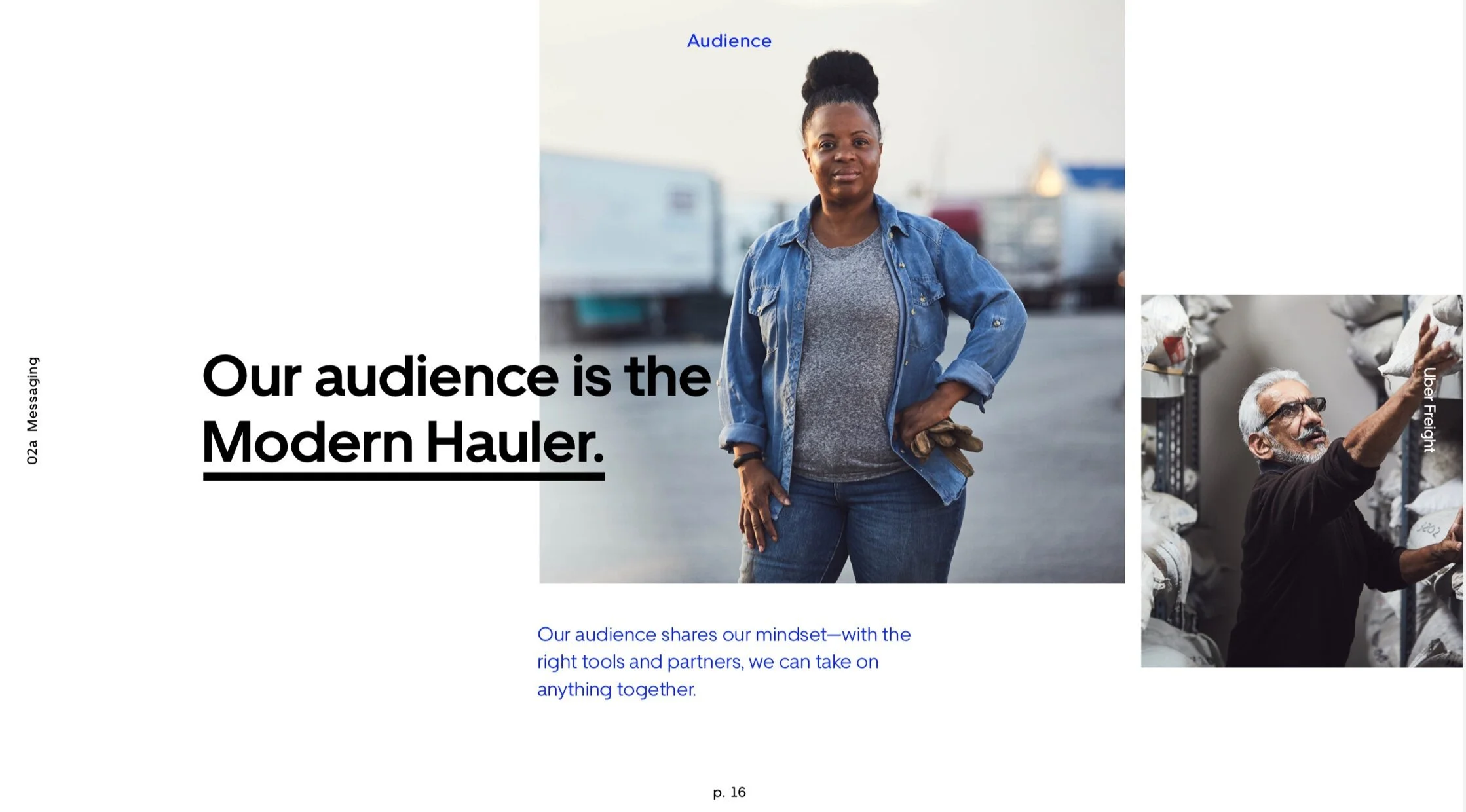
Concepted and art directed a full brand library photoshoot, with supporting shoots for international expansion and new programs. From talking to drivers I’ve learned that many of them are also artists, photographers and writers with unique stories. Editorializing them as more than just "movers" was crucial.
MESSAGING
03/05
Reconstructed our messaging strategy to be more direct and empathetic. Designed our conclusions into a brand playbook — read in full here.
WEB
04/05
Redesigned the website using new brand library and messaging. The site underwent extensive testing and iteration to optimize for sign-ups.
Testing: Accenture
Engineering: Haus
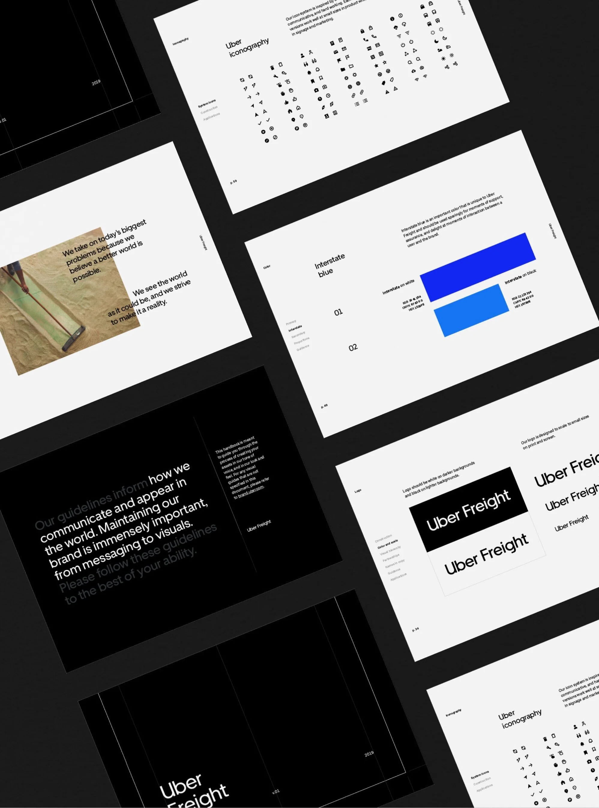
GUIDELINES
05/05
Produced styleguide and video / photo guidelines. Included instructions to navigate global / sub brand, activations and asset catalog.


